Key Point Overview:
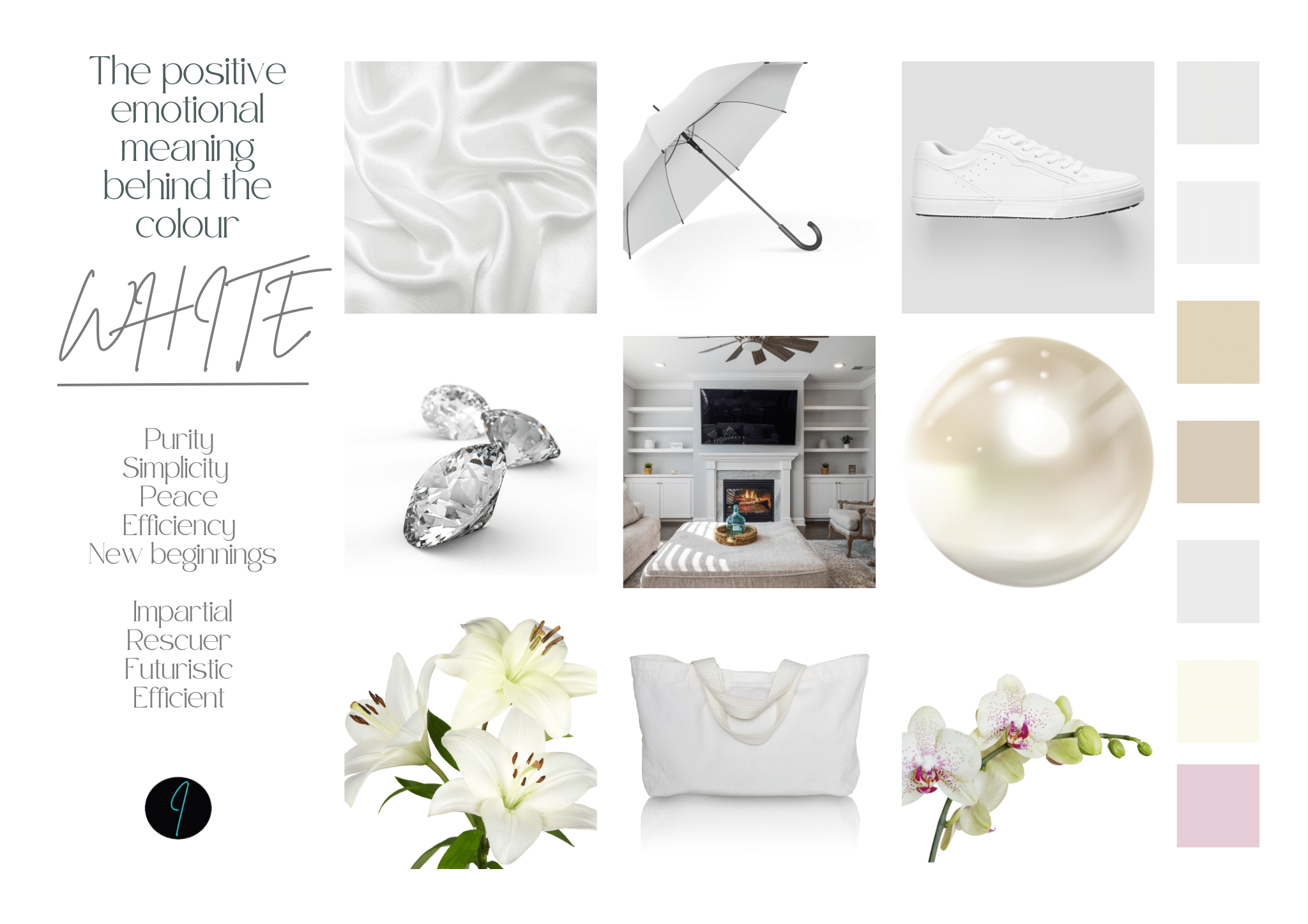
“Is white a neutral?” is the question we’re asking in this latest article. White is commonly grouped with neutrals like black, grey, and beige—but it doesn’t behave like one. This article explores why white should be treated as a colour in its own right, not a passive background player. Key reasons include:
- Reflective and Amplifying: White intensifies surrounding colours and undertones rather than blending quietly.
- Undertones Matter: Every white carries subtle warm or cool undertones that can clash or complement.
- Emotional and Psychological Impact: White can feel clinical, harsh, or stark—far from neutral.
- High Maintenance: It highlights imperfections and demands upkeep.
- Light Sensitivity: White shifts dramatically in different lighting conditions.
- Cultural Associations: White carries symbolic meanings that affect its versatility.
Understanding these complexities allows for more intentional and effective use of white in design, fashion, and colour consulting. Now read on for more detail:
In the world of design, fashion, and colour theory, white is often referred to as a “neutral” colour, lumped into the same category as black, grey, beige, and taupe. However, when we take a closer look at its behaviour and impact, it becomes clear that white is not as neutral as it might seem.
Here’s why white carries more complexity than its reputation suggests:
1. White Reflects and Amplifies
Unlike true neutrals, which tend to blend seamlessly with other colours, white has a unique reflective quality that amplifies its surroundings. It doesn’t simply coexist with other hues; it actively interacts with them, often intensifying their brightness or exposing undertones that might otherwise go unnoticed.
For example:
- In fashion: A crisp white shirt might highlight the warm or cool undertones of someone’s skin, potentially clashing if the white is too stark for their colouring.
- In interiors: White walls can make nearby colours appear harsher or cooler, creating contrasts that feel sharp rather than harmonious.
Neutral colours are often valued for their ability to fade into the background, but white rarely does this. Instead, it demands attention and alters the way other colours are perceived.
2. White Has Undertones
Despite being perceived as a “blank slate,” white is never truly neutral because it contains undertones. These undertones—warm (creamy, yellow, or peachy) or cool (blue, grey, or greenish)—influence how white behaves and whether it complements or clashes with surrounding colours.
For example:
- A warm white can look dingy or yellowish next to a true black.
- A cool white can appear icy or sterile when paired with soft, warm tones like beige or tan.
Choosing the wrong white can disrupt the balance of an otherwise cohesive palette, which is why colour experts caution against treating white as a “one-size-fits-all” solution.
3. White Evokes Strong Psychological Responses
True neutrals tend to have a calming, grounding effect, but white is highly evocative. Its associations with purity, sterility, and simplicity can elicit strong emotional reactions, both positive and negative.
- In design: Too much white can feel cold, unwelcoming, or overly clinical, like a hospital room.
- In fashion: Stark white can appear severe or even unflattering if it overwhelms the natural warmth or coolness of the wearer’s complexion.
Rather than fading into the background, white often becomes a dominant statement, making it unsuitable as a truly neutral choice.
4. White Is High-Maintenance
Another reason white isn’t truly neutral is its practical demands. Its reflective nature makes it prone to showing imperfections, whether that’s a smudge on a white shirt, a chip in white paint, or the unevenness of a textured white fabric.
True neutrals like grey, beige, or taupe are more forgiving, masking minor flaws and blending into their environment. White, on the other hand, highlights every detail, requiring constant maintenance to preserve its appearance.
5. White Reacts to Light
The colour white is highly reactive to lighting conditions, which can alter its appearance dramatically. A warm incandescent light might make white appear creamy, while cool fluorescent lighting can give it a blue or greyish cast.
True neutrals maintain their character in a wider range of lighting environments, while white’s shifting appearance adds a layer of unpredictability.
6. Cultural and Contextual Influences
In many cultures, white carries specific symbolic meanings, from purity and peace to mourning and sterility. These cultural associations make white less versatile than true neutrals, which tend to be more universally adaptable.
For instance, a beige sofa or a grey suit works across a wide range of contexts without drawing too much attention, while a white sofa or suit makes a statement that might not always be appropriate or desirable.
Conclusion: White as a Colour, Not a Neutral
While white is often marketed as a neutral colour, it behaves more like an active participant in any colour scheme. Its reflective properties, undertones, emotional impact, and maintenance demands make it anything but passive.
Rather than relying on white as a “safe” or “neutral” choice, consider it as a distinct colour with its own characteristics and challenges. By understanding its nuances, you can use white more effectively and avoid the pitfalls that come with treating it as a true neutral.
If you’d like to learn more about our Diploma Course in Advanced Colour Analysis please click the link.
If you’d like to know about our Bridal Stylist course hit the button:
If you’d like to now more about becoming a professional Personal Shopper hit this button:
Like to talk to a real person – you’ll find details for organising a discovery call here: Discovery Call for Colour Analysis Diploma Course
The information contained above is provided for information purposes only. The contents of this article “Is White a Neutral?” are not intended to amount to advice and you should not rely on any of the contents of this article. Professional advice should be obtained before taking or refraining from taking any action as a result of the contents of this article. Helen K-Tobias disclaims all liability and responsibility arising from any reliance placed on any of the contents of this article.
Last Updated on 18th April 2025 by Helen Tobias