Will your pink drape be the most used tool in your kit this summer? From soft pastel pinks to bold, vibrant fuchsia, there’s a shade of pink that can suit everyone. That’s lucky because, thanks to the launch of the Barbie movie, pink is the colour for summer 2023. Whether you’re a colour consultant or just curious about which pink works best for you, this is the perfect time to explore the variety of pinks available and how they interact with different skin tones.
The Story Behind Pink
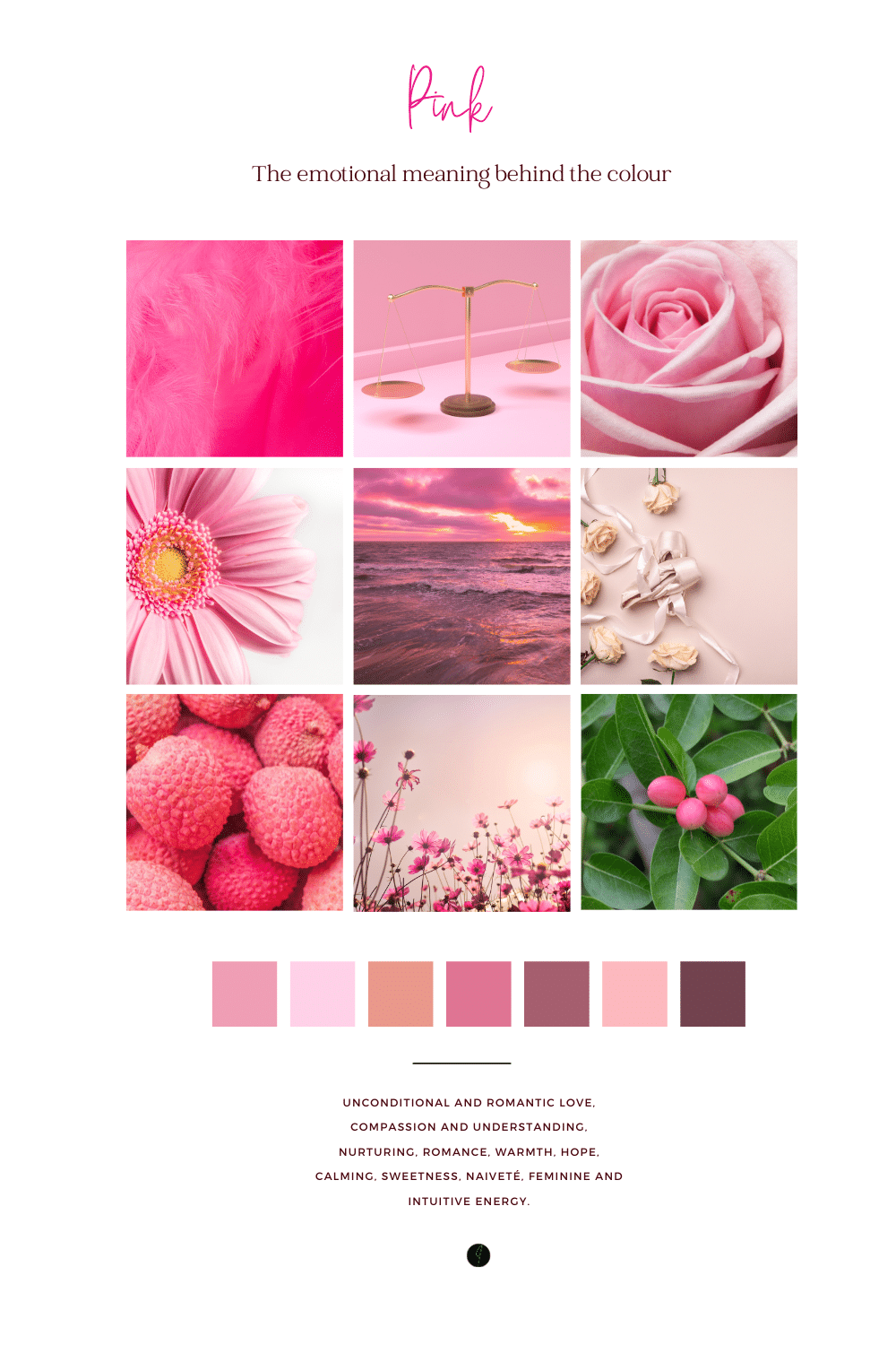
Before we dive into how different shades of pink work with seasonal skin tones, let’s take a quick look at the origin of the colour itself. The word pink actually comes from the name of a flower in the Dianthus family. It became recognized as a colour name in the late 17th century, describing a pale red shade. Over the centuries, pink has grown to symbolize everything from femininity and softness to boldness and power. And now, thanks to pop culture, it’s making a massive comeback.
While pink can be tricky for some people to wear—particularly those with autumn skin tones—there is a shade for everyone. With some guidance, you can find the one that makes your complexion shine.
Pink Drapes for Every Season
In colour analysis, pink is a fascinating colour because its tones vary so much across the seasons. When performing a colour analysis, your job as a consultant is to identify which shade of pink works best for each client. There are four shades of pink included in our Colour Kit, designed for use with our Colour Analysis Diploma Course, and each one corresponds to a season: Spring, Summer, Autumn, and Winter.
Let’s break down what to look for when draping each season:
Summer’s Powder Pink
The light, delicate pink of summer is almost universally flattering—especially on those with a summer skin tone. However, it can also look surprisingly good on winters, thanks to its base of primary red mixed with white. If you’re ever unsure whether a client is a summer or winter, try draping them in powder pink and compare it with the winter pink. While it works for both, the difference will be in the overall harmony of the shade on their skin.
Winter’s Deep Hot Pink
Winter clients often shine in the deep, intense pinks like hot pink or fuchsia. It’s bold, dramatic, and perfectly suited to their high-contrast colouring. That said, this shade can be too harsh for other seasons. When worn by springs, for example, it can highlight skin imperfections, making the complexion appear blotchy and older. Spring clients may initially be drawn to this vibrant pink, but once they see how it ages their skin, they usually come around to more flattering shades.
Spring’s Peachy Pink
Spring skin tones, known for their warmth, tend to look incredible in peachy pinks and corals. These colours enhance the golden undertones in their skin, making them look radiant and healthy. However, this does come with a little challenge: Spring clients often love pink and are tempted by the delicate shades of summer pink. While they can wear summer pink, it tends to look a bit bland on them compared to their own vibrant corals or peaches. It’s all about finding a balance that flatters their natural colouring.
Autumn’s Muted Pink
Autumn skin tones, with their earthy and warm qualities, often struggle with traditional pinks. They tend to fare better with muted, earthy versions of pink or peach. In fact, a muted peach often looks more flattering on them than brighter or cooler pinks.
However, when compared to the richer shades they typically wear, even muted pink can sometimes feel a bit off for autumns. If you’re working with an autumn client, it’s helpful to show them how peachy tones from the autumn palette truly enhance their skin’s glow, even if they lean towards softer pinks.
Pink Draping Tips: What to Look For
So, how do you determine which pink is best for your client? Here are a few tips to keep in mind as you drape:
- Compare similar shades: If you’re torn between seasons, use two similar shades of pink, like powder pink for summer and deep pink for winter. You’ll notice subtle but important differences in how they affect the skin.
- Watch for sallowness: Summer and winter clients might start to look a little sallow when draped in the warmer pinks of spring and autumn. This is a strong indicator that the warmer tones aren’t ideal for them.
- Skin clarity: Check for blotchiness or an uneven complexion, particularly when draping spring clients in winter pinks. Hot pink, while fun and bold, can highlight imperfections on the wrong skin tone.
- Client preferences: Clients may have emotional connections to certain shades of pink, especially if they’ve been drawn to them for years. Spring clients, for instance, often love wearing pink even if peach or coral suits them better. While it’s essential to guide them to the most flattering shades, understanding their preferences can help make the transition smoother.
How to Use Pink Drapes in Your Colour Kit
Our Colour Analysis Diploma Course includes four pink drapes—one for each season—and you’ll likely find yourself using them often this summer. Pink’s versatility makes it a must-have for your draping sessions, particularly with its current popularity. As you work with clients, you’ll see how powerful this colour can be, both in its flattering tones and in its ability to shift perceptions.
Final Thoughts
With the Barbie movie reigniting everyone’s love for pink, now is the perfect time to hone your draping skills and ensure your clients look their best in this trendy shade. Whether they’re a cool summer who shines in powder pink or a dramatic winter who owns fuchsia, there’s a shade for everyone. Even if your autumn clients may initially struggle with pink, you can guide them toward softer, muted tones that enhance their natural beauty.
At the end of the day, pink is all about fun, femininity, and confidence—and your clients will leave your consultations ready to embrace this vibrant, timeless colour.
What’s next:
Find out more about Colour Analysis in our article Seasonal Colour Analysis 101
Follow us on Pinterest
Follow us on FaceBook
#pinkdrape #barbiepink #summer2023